The root.tsx file in Remix
What is Remix?
Section titled “What is Remix?”Remix is a full-stack web framework that makes building web applications easy and fun. It is built on top of React, a popular JavaScript library for building user interfaces.
The Remix root.tsx file
Section titled “The Remix root.tsx file”This tutorial will guide you through updating the user interface (UI) in one of the most important files of a Remix project: the root.tsx file.
We’ll start with the basics, so don’t worry if you’re not familiar with these technologies yet. Let’s dive in!
Getting Started
Section titled “Getting Started”Before we begin, ensure you have npm (Node Package Manager) installed on your system as it’s essential for running our project server and managing our dependencies.
1. Start the Server
Section titled “1. Start the Server”First, we need to start our development server. Open your terminal, navigate to your project directory, and run:
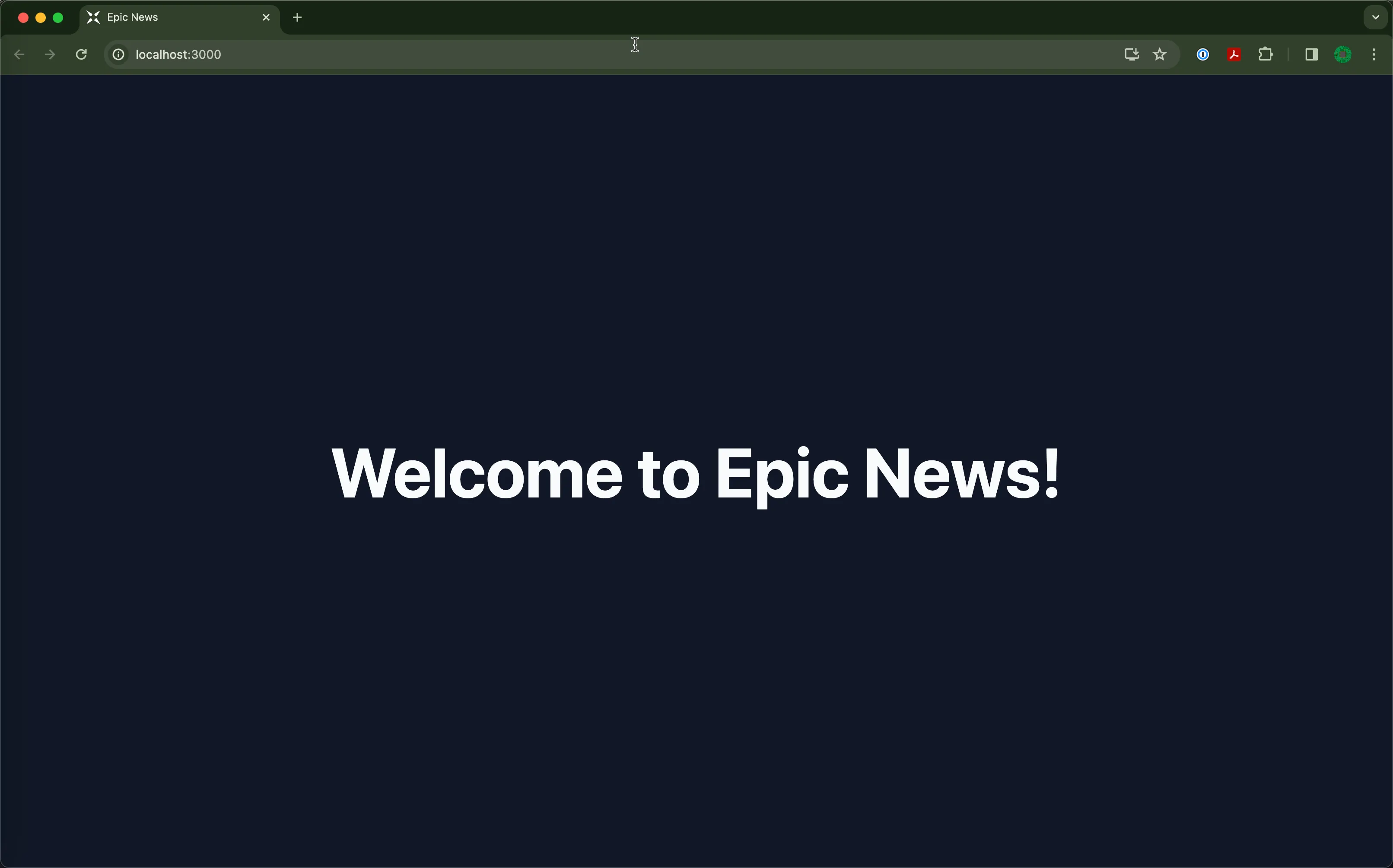
npm run devThis command starts a local development server. Once it is up and running, you can view your project in a web browser by going to http://localhost:3000:
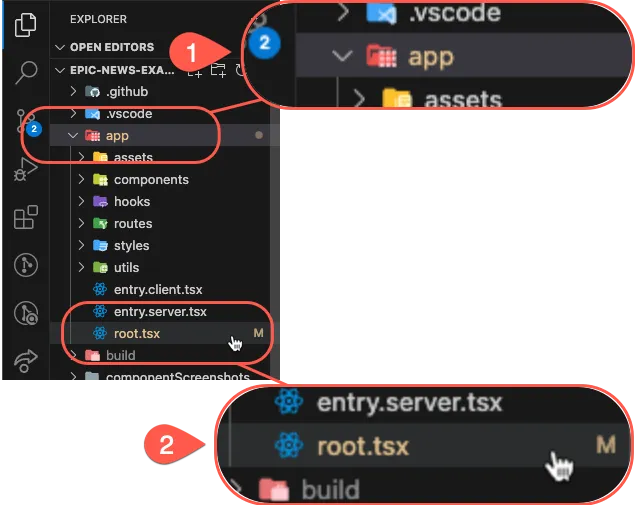
2. Locate the app/root.tsx file
Section titled “2. Locate the app/root.tsx file”The root.tsx file is located in the app directory of your project.
Look carefully through the project structure to find it in the VS Code file explorer (or your own code editor):
3. Open and update root.tsx
Section titled “3. Open and update root.tsx”What is the root.tsx file?
Section titled “What is the root.tsx file?”Think of it as the starting point where all the UI elements come together and get rendered on the screen.
At the moment, it doesn’t seem all that impressive, but we’ll change that soon!
Updating the text
Section titled “Updating the text”To change the existing text, locate the <h1> tag inside the App function of your root.tsx file:
13 collapsed lines
import { useLoaderData } from 'react-router'import { type Route } from './+types/root.ts'import { type loader } from './__root.server.tsx'import { GeneralErrorBoundary } from './components/error-boundary.tsx'import Document from './components/shared-layout/Document.tsx'import { useNonce } from './utils/nonce-provider.ts'import rootLinkElements from './utils/providers/rootLinkElements.ts'
export const links: Route.LinksFunction = () => { return rootLinkElements}export { meta } from './__root.client.tsx'export { headers, loader } from './__root.server.tsx'
export default function App() { const data = useLoaderData<typeof loader | null>() const nonce = useNonce()
return ( <Document nonce={nonce} honeyProps={data?.honeyProps}> <div className="flex h-screen flex-col justify-between"> <div className="flex-1"> <main className="grid h-full place-items-center"> <h1 className="text-mega">Welcome to Epic News!</h1> </main> </div> </div> </Document> )}
export const ErrorBoundary = GeneralErrorBoundaryChange "Welcome to Epic News!" to any message you like, such as Your Journey Begins!.
<h1 className="text-mega">Your Journey Begins!</h1>Save the file and your browser should automatically refresh, displaying the new message.
3. Add a New Element to the Page
Section titled “3. Add a New Element to the Page”Let’s add a new paragraph (<p>) element below the <h1> tag. This will demonstrate how to insert new content into your page.
<main className="grid h-full place-items-center"> <h1 className="text-mega">Your Journey Begins!</h1> <p>Welcome to Epic News, where the latest developments in tech are found.</p></main>4. Style the New Element Using Tailwind Classes
Section titled “4. Style the New Element Using Tailwind Classes”To style the paragraph, we’ll use TailwindCSS, a utility-first CSS framework. If you’re not familiar with Tailwind, it lets you style elements by adding class names directly in your HTML (or JSX in this case).
<p className="text-base text-gray-600"> Welcome to Epic News, where the latest developments in tech are found.</p>5. Make the New Element Responsive
Section titled “5. Make the New Element Responsive”Tailwind makes creating responsive designs straightforward. To demonstrate, let’s make the font size of our paragraph larger on medium (md) and large (lg) screens.
<p className="text-base text-gray-600 md:text-lg lg:text-xl"> Welcome to Epic News, where the latest developments in tech are found.</p>Congratulations! 🥳
Section titled “Congratulations! 🥳”You’ve just updated your first Remix UI, added elements, styled them, and made them responsive with Tailwind.
Keep experimenting with different elements and styles to further enhance your page.