From 'dark' to 'light' mode
Allowing users to switch between a ‘light’ and ‘dark’ mode on your website is something most people expect from a modern web application. It also helps improve accessibility for the site, allowing users to settle on a theme that suits them best.
The only problem is that implementing a light and dark mode is surprisingly difficult. Luckily, the Epic Stack has most of the code for this already included.
All we need to do is implement it 🚀.
Trigger ‘light’ and ‘dark’ mode with code
Section titled “Trigger ‘light’ and ‘dark’ mode with code”Open app/root.tsx and look carefully at the App function being exported:
7 collapsed lines
import { useLoaderData } from 'react-router'import { type Route } from './+types/root.ts'import { type loader } from './__root.server.tsx'import { GeneralErrorBoundary } from './components/error-boundary.tsx'import Document from './components/shared-layout/Document.tsx'import { useNonce } from './utils/nonce-provider.ts'import rootLinkElements from './utils/providers/rootLinkElements.ts'
export const links: Route.LinksFunction = () => { return rootLinkElements}export { meta } from './__root.client.tsx'export { headers, loader } from './__root.server.tsx'
export default function App() { const data = useLoaderData<typeof loader | null>() const nonce = useNonce()
return ( <Document nonce={nonce} honeyProps={data?.honeyProps}> <div className="flex h-screen flex-col justify-between"> <div className="flex-1"> <main className="grid h-full place-items-center"> <h1 className="text-mega">Welcome to Epic News!</h1> </main> </div> </div> </Document> )}
export const ErrorBoundary = GeneralErrorBoundaryThe Document component
Section titled “The Document component”Notice the Document component that wraps everything being returned from the App function?
import { useLoaderData } from 'react-router'import { type Route } from './+types/root.ts'import { type loader } from './__root.server.tsx'import { GeneralErrorBoundary } from './components/error-boundary.tsx'import Document from './components/shared-layout/Document.tsx'import { useNonce } from './utils/nonce-provider.ts'import rootLinkElements from './utils/providers/rootLinkElements.ts'
5 collapsed lines
export const links: Route.LinksFunction = () => { return rootLinkElements}export { meta } from './__root.client.tsx'export { headers, loader } from './__root.server.tsx'
export default function App() { const data = useLoaderData<typeof loader | null>() const nonce = useNonce()
return ( <Document nonce={nonce} honeyProps={data?.honeyProps}> <div className="flex h-screen flex-col justify-between"> <div className="flex-1"> <main className="grid h-full place-items-center"> <h1 className="text-mega">Welcome to Epic News!</h1> </main> </div> </div> </Document> )}
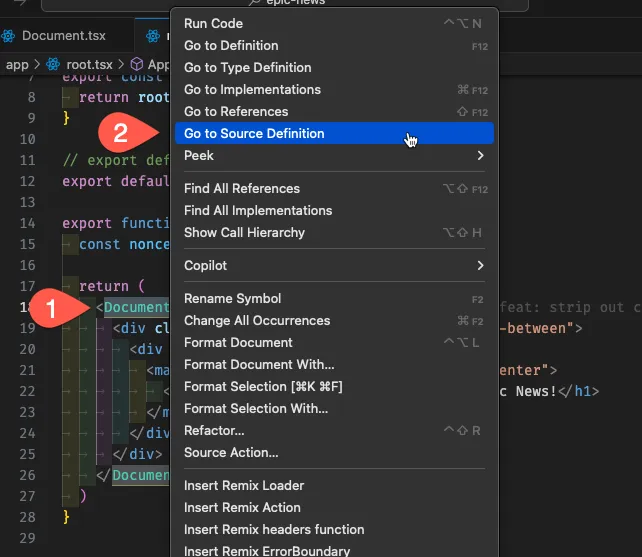
export const ErrorBoundary = GeneralErrorBoundaryRight-click the opening Document tag, and select ‘Go to Source Definition’ from the option menu:
This will open the file where the Document component code is held:
import { OpenImgContextProvider } from 'openimg/react'import { Meta, Links, ScrollRestoration, Scripts } from 'react-router'import { HoneypotProvider } from 'remix-utils/honeypot/react'import { ClientHintCheck } from '#app/utils/client-hints'import { getImgSrc } from '#app/utils/misc.tsx'import { type Theme } from '#app/utils/theme.server'
interface DocumentProps {  children: React.ReactNode  nonce: string  honeyProps:    | {        nameFieldName: string        validFromFieldName: string | null        encryptedValidFrom: string      }    | undefined  theme?: Theme  env?: Record<string, string | undefined>}
export default function Document({ children, honeyProps, nonce, theme = 'dark', env = {},}: DocumentProps) { const allowIndexing = ENV.ALLOW_INDEXING !== 'false' return ( <HoneypotProvider {...honeyProps}> <OpenImgContextProvider optimizerEndpoint="/resources/images" getSrc={getImgSrc} > <html lang="en" className={`${theme} h-full overflow-x-hidden`}> <head> <ClientHintCheck nonce={nonce} /> <Meta /> <meta charSet="utf-8" /> <meta name="viewport" content="width=device-width,initial-scale=1" /> {allowIndexing ? null : ( <meta name="robots" content="noindex, nofollow" /> )} <Links /> </head> <body className="bg-background text-foreground"> {children} <script nonce={nonce} dangerouslySetInnerHTML={{ __html: `window.ENV = ${JSON.stringify(env)}`, }} /> <ScrollRestoration nonce={nonce} /> <Scripts nonce={nonce} /> </body> </html> </OpenImgContextProvider> </HoneypotProvider> )}Manually updating from ‘light’ to ‘dark’ themes
Section titled “Manually updating from ‘light’ to ‘dark’ themes”Head back over to app/components/shared-layout/Document.tsx if you are not in it already.
Find the line that reads theme = 'dark', around line 16.
Change this to theme = 'light' and save the file:
export default function Document({ children, honeyProps, nonce, theme = 'dark', theme = 'light', env = {},}: DocumentProps) {You should see the website in the browser looks completely different:

Why? Tailwind classes and string interpolation
Section titled “Why? Tailwind classes and string interpolation”Take a closer look at the opening html component being returned from the Document function.
Can you see how the value of the theme variable has been slotted into the className property (or ‘prop’)?
export default function Document({ children, honeyProps, nonce, theme = 'light', env = {},}: DocumentProps) { return ( <html lang="en" className={`${theme} h-full overflow-x-hidden`}>21 collapsed lines
<head> <ClientHintCheck nonce={nonce} /> <Meta /> <meta charSet="utf-8" /> <meta name="viewport" content="width=device-width,initial-scale=1" /> {allowIndexing ? null : ( <meta name="robots" content="noindex, nofollow" /> )} <Links /> </head> <body className="bg-background text-foreground"> {children} <script nonce={nonce} dangerouslySetInnerHTML={{ __html: `window.ENV = ${JSON.stringify(env)}`, }} /> <ScrollRestoration nonce={nonce} /> <Scripts nonce={nonce} /> </body> </html> )}This is called interpolation, and is a way of inserting the value of a variable into a string in JavaScript.
Summary
Section titled “Summary”In this tutorial, we’ve learned:
- How to switch between ‘light’ and ‘dark’ themes in the Epic Stack.
- How to manually update the theme from ‘dark’ to ‘light’ in the
Documentcomponent. - How to use string interpolation to insert the value of a variable into a string.
- How to use TypeScript interfaces to define the shape of an object.
- How to use React props to pass data into a component.
What’s next?
Section titled “What’s next?”What we need now is a way for users to control the value of theme dynamically from the front-end, so they can switch easily between both.
In our next tutorial, we add a button that users can click to toggle between the two states.