`HeroCallToAction` component
Objectives
Section titled “Objectives”In this tutorial, you will:
- explore the characteristics and purpose of a landing page hero section
- learn how to import, understand and use a pre-built React component in your website.
- identify props in React, and describe how they are used to pass data into a component.
Hero sections
Section titled “Hero sections”Hero sections are the first thing you see when you visit a website.
But what exactly is their purpose, and what makes a ‘good’ one?
Importing a component
Section titled “Importing a component”There are two main hero components included with the Epic News starter project 🎉🎉
In this first guide, we will look at the HeroCallToAction component.

The HeroCallToAction component provides a handy template for displaying a hero section on your site.
Unfortunately, the code for this lives in app/components/organisms/Hero/HeroCallToAction.tsx, which is a completely different file to the one we have been working on at app/root.tsx!
So how can we use it? 🤔
Displaying the component
Section titled “Displaying the component”Now we’ve imported the component, we can display it just below the main page heading.
-
Find the opening
<h1>tag in theapp/root.tsxfile, somewhere around line 62:app/root.tsx 49 collapsed linesimport { RiTwitterXFill, RiLinkedinBoxFill } from 'react-icons/ri'import { useLoaderData } from 'react-router'import { type Route } from './+types/root.ts'import { type loader } from './__root.server.tsx'import { GeneralErrorBoundary } from './components/error-boundary.tsx'import FooterLogoCentre from './components/organisms/Footer/FooterLogoCentre.tsx'import HeaderWithSearch from './components/organisms/HeaderWithSearch/index.tsx'import Document from './components/shared-layout/Document.tsx'import { ThemeSwitch, useTheme } from './routes/resources+/theme-switch.tsx'import { useNonce } from './utils/nonce-provider.ts'import rootLinkElements from './utils/providers/rootLinkElements.ts'import headshot from '~/assets/jpg/portrait-01.jpg'import headshot2 from '~/assets/jpg/portrait-02.jpg'import headshot3 from '~/assets/jpg/portrait-03.jpg'import HeroCallToAction from '~/components/organisms/Hero/HeroCallToAction.tsx'export const links: Route.LinksFunction = () => {return rootLinkElements}export { meta } from './__root.client.tsx'export { headers, loader } from './__root.server.tsx'interface TeamMemberCardProps {name: stringrole: stringimageSrc: string}export function TeamMemberCard({ name, role, imageSrc }: TeamMemberCardProps) {return (<div className="w-fit rounded-lg bg-slate-800 p-8"><imgsrc={imageSrc}alt="An employee"className="mx-auto h-64 w-64 rounded-full"/><div className="pt-6"><h3 className="font-semi-bold text-center text-white">{name}</h3><p className="pt-1 text-center text-slate-400">{role}</p><div className="flex justify-center gap-4 pt-6 text-slate-400"><RiTwitterXFill /><RiLinkedinBoxFill /></div></div></div>)}export default function App() {const data = useLoaderData<typeof loader | null>()const nonce = useNonce()const theme = useTheme()return (<Document theme={theme} nonce={nonce} honeyProps={data?.honeyProps}><div className="flex h-screen flex-col justify-between"><div className="flex-1"><HeaderWithSearch /><main className="grid h-full place-items-center"><h1 className="text-mega">Epic News</h1><div className="m-4 flex gap-4">15 collapsed lines<TeamMemberCardname="Leonard Krasner"role="Senior Designer"imageSrc={headshot}/><TeamMemberCardname="John Smith"role="Lead Developer"imageSrc={headshot2}/><TeamMemberCardname="Jane Doe"role="Marketing Manager"imageSrc={headshot3}/></div></main></div><div className="container flex justify-between pb-5"><ThemeSwitch userPreference={data?.requestInfo.userPrefs.theme} /></div><FooterLogoCentre /></div></Document>)}export const ErrorBoundary = GeneralErrorBoundary -
Next, slot the
HeroCallToActioncomponent just below theh1tag:app/root.tsx 49 collapsed linesimport { RiTwitterXFill, RiLinkedinBoxFill } from 'react-icons/ri'import { useLoaderData } from 'react-router'import { type Route } from './+types/root.ts'import { type loader } from './__root.server.tsx'import { GeneralErrorBoundary } from './components/error-boundary.tsx'import FooterLogoCentre from './components/organisms/Footer/FooterLogoCentre.tsx'import HeaderWithSearch from './components/organisms/HeaderWithSearch/index.tsx'import Document from './components/shared-layout/Document.tsx'import { ThemeSwitch, useTheme } from './routes/resources+/theme-switch.tsx'import { useNonce } from './utils/nonce-provider.ts'import rootLinkElements from './utils/providers/rootLinkElements.ts'import headshot from '~/assets/jpg/portrait-01.jpg'import headshot2 from '~/assets/jpg/portrait-02.jpg'import headshot3 from '~/assets/jpg/portrait-03.jpg'import HeroCallToAction from '~/components/organisms/Hero/HeroCallToAction.tsx'export const links: Route.LinksFunction = () => {return rootLinkElements}export { meta } from './__root.client.tsx'export { headers, loader } from './__root.server.tsx'interface TeamMemberCardProps {name: stringrole: stringimageSrc: string}export function TeamMemberCard({ name, role, imageSrc }: TeamMemberCardProps) {return (<div className="w-fit rounded-lg bg-slate-800 p-8"><imgsrc={imageSrc}alt="An employee"className="mx-auto h-64 w-64 rounded-full"/><div className="pt-6"><h3 className="font-semi-bold text-center text-white">{name}</h3><p className="pt-1 text-center text-slate-400">{role}</p><div className="flex justify-center gap-4 pt-6 text-slate-400"><RiTwitterXFill /><RiLinkedinBoxFill /></div></div></div>)}export default function App() {const data = useLoaderData<typeof loader | null>()const nonce = useNonce()const theme = useTheme()return (<Document theme={theme} nonce={nonce} honeyProps={data?.honeyProps}><div className="flex h-screen flex-col justify-between"><div className="flex-1"><HeaderWithSearch /><main className="grid h-full place-items-center"><h1 className="text-mega">Epic News</h1><div className="w-full py-16"><HeroCallToAction /></div><div className="m-4 flex gap-4">15 collapsed lines<TeamMemberCardname="Leonard Krasner"role="Senior Designer"imageSrc={headshot}/><TeamMemberCardname="John Smith"role="Lead Developer"imageSrc={headshot2}/><TeamMemberCardname="Jane Doe"role="Marketing Manager"imageSrc={headshot3}/></div></main></div><div className="container flex justify-between pb-5"><ThemeSwitch userPreference={data?.requestInfo.userPrefs.theme} /></div><FooterLogoCentre /></div></Document>)}export const ErrorBoundary = GeneralErrorBoundaryYou will notice that the
HeroCallToActioncomponent is underlined in red. You can see why by hovering your mouse over it: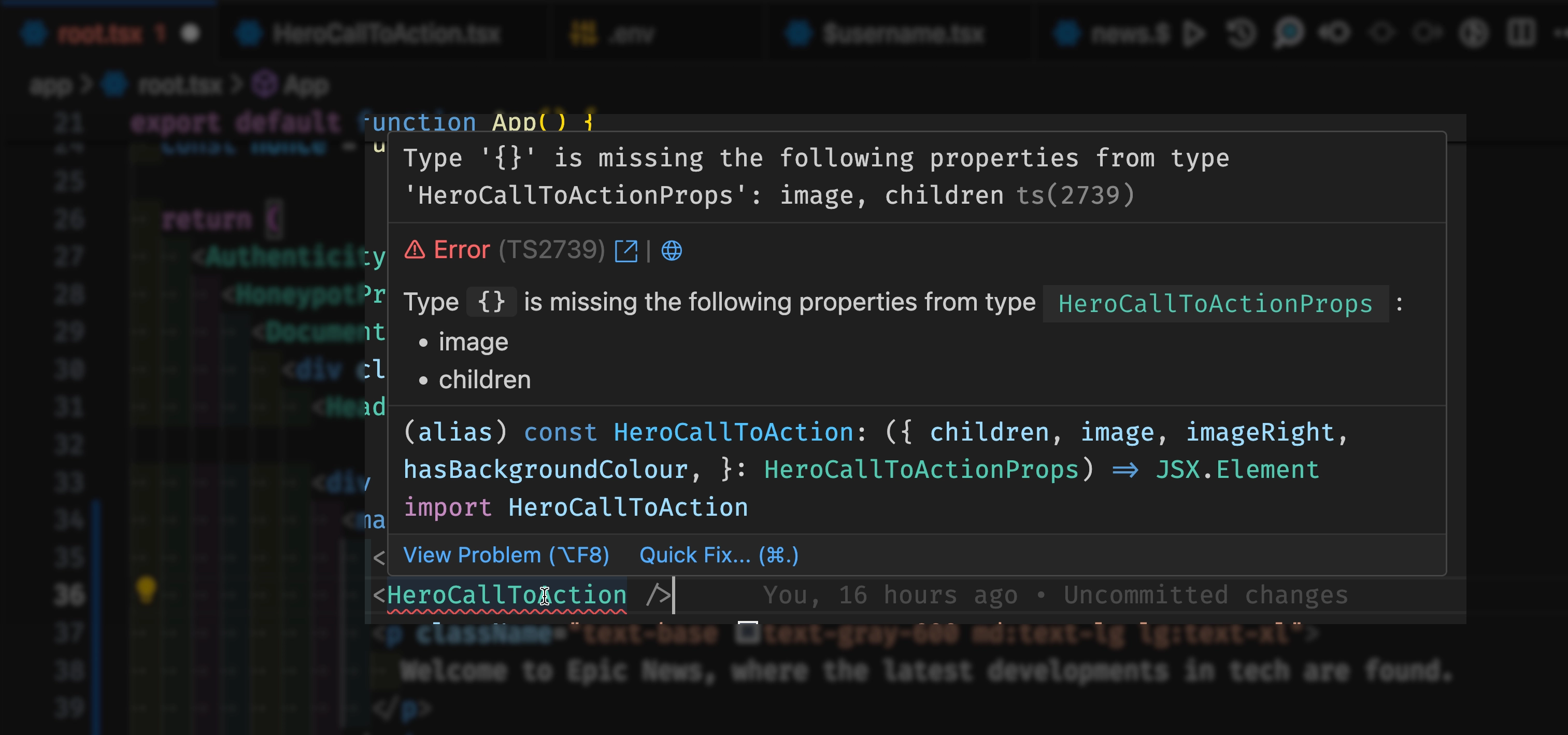
-
Delete the line shown in red, and add the section of JSX code shown in green below:
app/root.tsx 49 collapsed linesimport { RiTwitterXFill, RiLinkedinBoxFill } from 'react-icons/ri'import { useLoaderData } from 'react-router'import { type Route } from './+types/root.ts'import { type loader } from './__root.server.tsx'import { GeneralErrorBoundary } from './components/error-boundary.tsx'import FooterLogoCentre from './components/organisms/Footer/FooterLogoCentre.tsx'import HeaderWithSearch from './components/organisms/HeaderWithSearch/index.tsx'import Document from './components/shared-layout/Document.tsx'import { ThemeSwitch, useTheme } from './routes/resources+/theme-switch.tsx'import { useNonce } from './utils/nonce-provider.ts'import rootLinkElements from './utils/providers/rootLinkElements.ts'import headshot from '~/assets/jpg/portrait-01.jpg'import headshot2 from '~/assets/jpg/portrait-02.jpg'import headshot3 from '~/assets/jpg/portrait-03.jpg'import HeroCallToAction from '~/components/organisms/Hero/HeroCallToAction.tsx'export const links: Route.LinksFunction = () => {return rootLinkElements}export { meta } from './__root.client.tsx'export { headers, loader } from './__root.server.tsx'interface TeamMemberCardProps {name: stringrole: stringimageSrc: string}export function TeamMemberCard({ name, role, imageSrc }: TeamMemberCardProps) {return (<div className="w-fit rounded-lg bg-slate-800 p-8"><imgsrc={imageSrc}alt="An employee"className="mx-auto h-64 w-64 rounded-full"/><div className="pt-6"><h3 className="font-semi-bold text-center text-white">{name}</h3><p className="pt-1 text-center text-slate-400">{role}</p><div className="flex justify-center gap-4 pt-6 text-slate-400"><RiTwitterXFill /><RiLinkedinBoxFill /></div></div></div>)}export default function App() {const data = useLoaderData<typeof loader | null>()const nonce = useNonce()const theme = useTheme()return (<Document theme={theme} nonce={nonce} honeyProps={data?.honeyProps}><div className="flex h-screen flex-col justify-between"><div className="flex-1"><HeaderWithSearch /><main className="grid h-full place-items-center"><h1 className="text-mega">Epic News</h1><HeroCallToAction /><div className="w-full py-16"><HeroCallToAction image="https://www.helpguide.org/wp-content/uploads/2020/01/Social-Media-and-Mental-Health.webp"><div className="flex flex-col gap-8 px-8"><h2 className="text-h2">Welcome to Epic News</h2><p className="text-lg">Keep up to date with the latest tech news.</p></div></HeroCallToAction></div><div className="m-4 flex gap-4">15 collapsed lines<TeamMemberCardname="Leonard Krasner"role="Senior Designer"imageSrc={headshot}/><TeamMemberCardname="John Smith"role="Lead Developer"imageSrc={headshot2}/><TeamMemberCardname="Jane Doe"role="Marketing Manager"imageSrc={headshot3}/></div></main></div><div className="container flex justify-between pb-5"><ThemeSwitch userPreference={data?.requestInfo.userPrefs.theme} /></div><FooterLogoCentre /></div></Document>)}export const ErrorBoundary = GeneralErrorBoundary -
Save the changes to your file and head back to your browser.
You should now see the
HeroCallToActioncomponent displayed correctly on your site:
Understanding the HeroCallToAction props
Section titled “Understanding the HeroCallToAction props”So how can we understand what props are needed by the HeroCallToAction component?
🤔
-
Open the component file at
app/components/organisms/Hero/HeroCallToAction.tsx(if you haven’t already).If you look at the code, you will see that it has something called an
interfacedefined at the very top of the file.This interface describes the props that the component expects to receive.
Let’s take a look:
app/components/organisms/Hero/HeroCallToAction.tsx interface HeroCallToActionProps {image: stringimageRight?: booleanhasBackgroundColour?: booleanchildren: React.ReactNode}const HeroCallToAction = ({26 collapsed lineschildren,image,imageRight = false,hasBackgroundColour = false,}: HeroCallToActionProps) => {return (<divclassName={`md:mx-auto md:flex md:max-w-6xl ${imageRight && 'md:flex-row-reverse'}`}><div className="relative flex h-96 items-center justify-center overflow-hidden md:h-[32rem] md:w-1/2"><imgsrc={image}alt="A hero with a call to action."className="absolute min-h-full min-w-full object-cover object-center"/></div><div className="relative flex h-96 items-center justify-center md:h-[32rem] md:w-1/2">{children}</div></div>)}export default HeroCallToActionThis tells us that the component has two optional props as well as the essential ones we’ve been using already.
Optional props are those that don’t have to be passed to the component when it is used, but can be if needed.
We can tell which props are optional by the
?symbol after the prop name:app/components/organisms/Hero/HeroCallToAction.tsx interface HeroCallToActionProps {image: stringimageRight?: booleanhasBackgroundColour?: booleanchildren: React.ReactNode}The
imageRightprop is a boolean that determines whether the image should be displayed on the right or left side of the component.The
hasBackgroundColourprop is another boolean, but this one determines whether the component should have a background colour. -
Let’s try adding an
imageRightprop to the component where we call it inapp/root.tsx:app/root.tsx <HeroCallToActionimage="https://www.helpguide.org/wp-content/uploads/2020/01/Social-Media-and-Mental-Health.webp"imageRight={true}><div className="flex flex-col gap-8 px-8"><h2 className="text-h2">Welcome to Epic News</h2><p className="text-lg">Keep up to date with the latest tech news.</p></div></HeroCallToAction> -
With this change saved, check your browser again:
Notice how the picture has shifted from the left to the right?
Housekeeping
Section titled “Housekeeping”You’ll notice that, as we’ve been adding more imports to the top of app/root.tsx, a few of these have been underlined with yellow squiggly lines.
This is because ESLint wants us to organise our imports in a certain way.
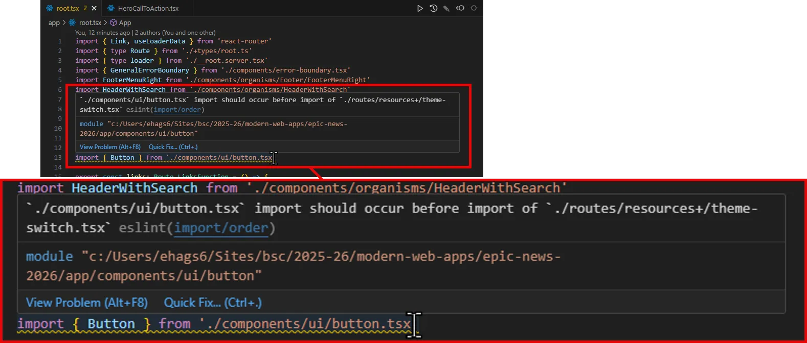
To fix this, hover your mouse over an underlined import and, after a moment, select Quick Fix > Fix all auto-fixable problems from the options that appear:
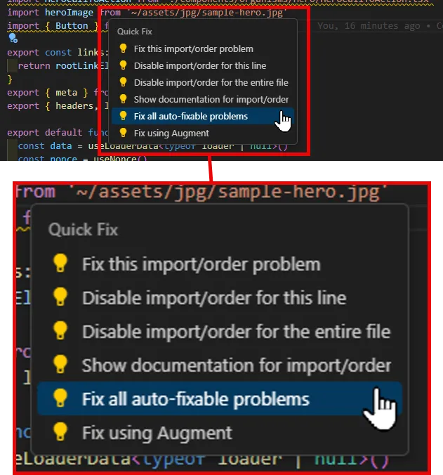
VS Code will automatically organise your imports for you, and the yellow underlines will disappear.
Summary
Section titled “Summary”In this step, we have:
- Used the
HeroCallToActioncomponent to display a hero section on our site. - Explored the
HeroCallToActioncomponent’s props and how to pass them to the component. - Customised the
HeroCallToActioncomponent by adding our own custom content and styling.
What’s next?
Section titled “What’s next?”In the next step, we will import and use another custom component - the ParallaxBackground hero component.