Hero `ParallaxBackground`
Introduction
Section titled “Introduction”The second custom component we are going to look at is the ParallaxBackground hero component.
This component generates a full width hero image with an optional call-to-action overlay.
It is further enhanced with a parallax effect when users scroll up or down
Installing an NPM package
Section titled “Installing an NPM package”Start by opening the component file in question at app/components/organisms/Hero/ParallaxBackground.tsx.
If you look at the import statement at the top of the file, you will see a red underline under the react-scroll-parallax package.
Hover your mouse over the package name to see the error message:
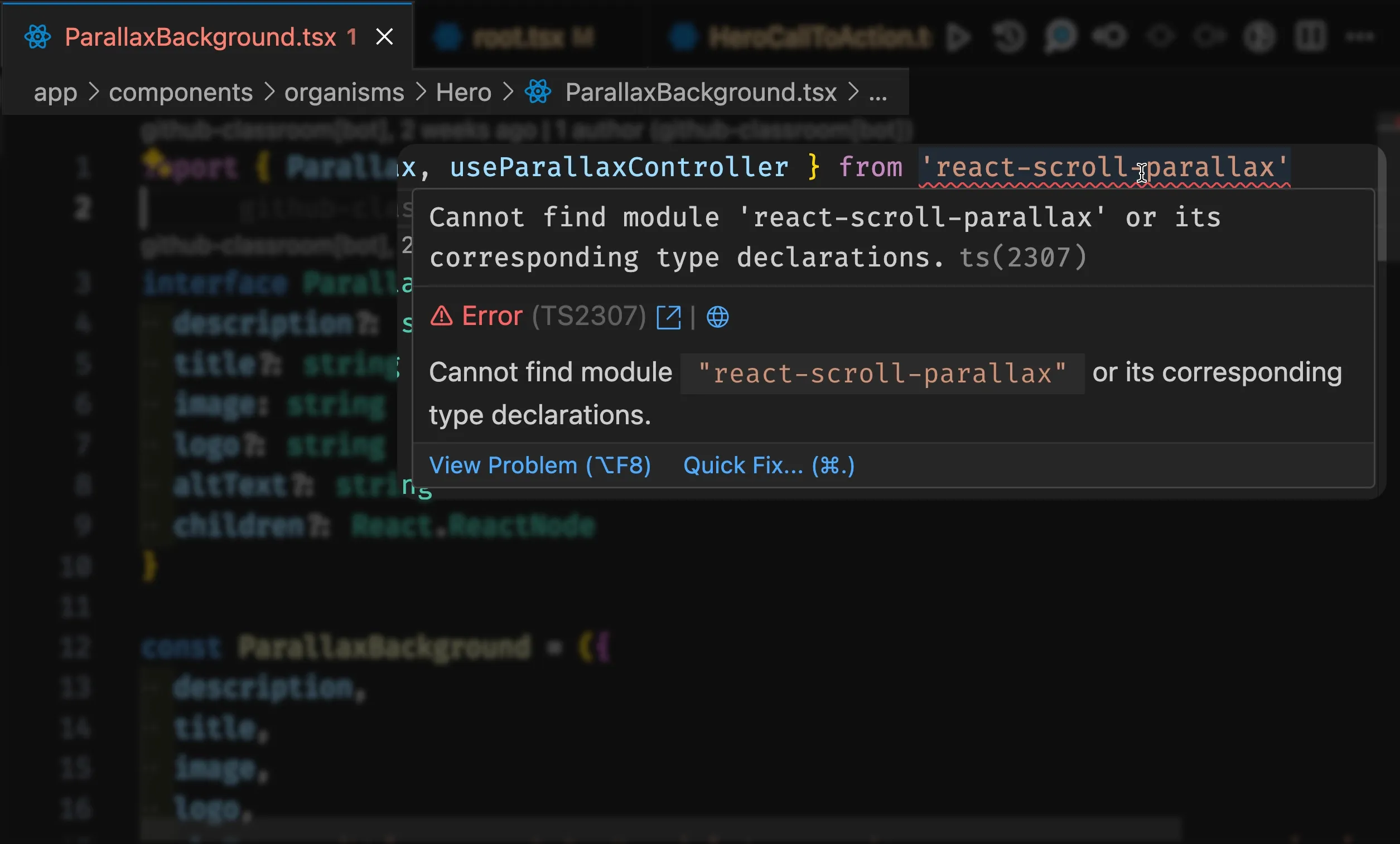
This error message indicates that the react-scroll-parallax NPM package is not installed in your project.
If you ever see an error message like this on an import, it means you need to install the package into your project. This is done using the npm install command, followed by the package name.
Installing react-scroll-parallax
Section titled “Installing react-scroll-parallax”-
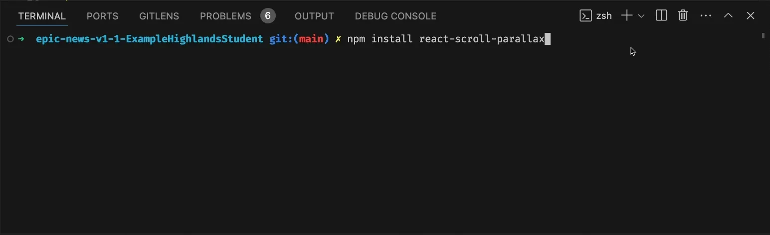
Stop your server (if it is running) by clicking into the terminal panel and typing CTRL + C (or CMD + C on Mac)
-
Next type or copy the following command in your terminal and hit enter:
npm install react-scroll-parallaxAfter a few seconds, you should see a message like this:
With the package installed successfully, we can begin to use the ParallaxBackground component in our project.
Wrapper component
Section titled “Wrapper component”The react-scroll-parallax package requires that our ENTIRE application is wrapped in a ParallaxProvider component. This allows the package to track the parallax effect across multiple areas of the app.
-
Firstly, open
app/root.tsx. -
Next,
importtheParallaxProviderat the top of yourapp/root.tsxfile:
9 collapsed lines
import { Link, useLoaderData } from 'react-router'import { type Route } from './+types/root.ts'import { type loader } from './__root.server.tsx'import { GeneralErrorBoundary } from './components/error-boundary.tsx'import FooterMenuRight from './components/organisms/Footer/FooterMenuRight'import HeaderWithSearch from './components/organisms/HeaderWithSearch'import HeroCallToAction from './components/organisms/Hero/HeroCallToAction.tsx'import Document from './components/shared-layout/Document.tsx'import { Button } from './components/ui/button.tsx'import { ThemeSwitch, useTheme } from './routes/resources+/theme-switch.tsx'import { useNonce } from './utils/nonce-provider.ts'import rootLinkElements from './utils/providers/rootLinkElements.ts'import heroImage from '~/assets/jpg/sample-hero.jpg'import { ParallaxProvider } from 'react-scroll-parallax'- Next, wrap all the JSX that is being returned from the
Appcomponent inside theParallaxProvidercomponent like so:
export default function App() { const data = useLoaderData<typeof loader | null>() const theme = useTheme() const nonce = useNonce()
return ( <ParallaxProvider> <Document nonce={nonce} theme={theme} honeyProps={data?.honeyProps}> <div className="flex h-screen flex-col justify-between"> <HeaderWithSearch />
34 collapsed lines
<div className="flex-1"> <main className="grid h-full"> <HeroCallToAction image={heroImage} imageRight={true} hasBackgroundColour={true} > <div className="flex h-full flex-1 flex-col justify-between p-16"> <div className="flex flex-col gap-8"> <h2 className="text-h2">Welcome to Epic News</h2> <p className="text-lg"> Keep up to date with the latest tech news. </p> </div> <Button asChild variant="default" size="lg"> <Link to="/signup">Sign up</Link> </Button> </div> </HeroCallToAction>
<ParallaxBackground image={heroImage} title="Epic News" logo={logo} />
<div className="container"> <p className="text-base text-gray-600 md:text-lg lg:text-xl"> Welcome to Epic News, where the latest developments in tech are found. </p> </div> </main> </div>
<div className="container flex justify-between pb-5"> <ThemeSwitch userPreference={data?.requestInfo.userPrefs.theme} /> </div> <FooterMenuRight /> </div> </Document> </ParallaxProvider> )}Using the ParallaxBackground component
Section titled “Using the ParallaxBackground component”The ParallaxBackground component is now ready to be used in the app.
We just need to import and configure it.
With your two hero sections in place, decide which you like best.
Do you prefer the ‘Hero call to action’ or the ‘Parallax Background’?
Decide on your favourite, and delete the other from app/root.tsx. Remember you can always customise your choice further if you wish.
Experimentation
Section titled “Experimentation”There are lots of other custom components that I can share with you in OneNote.
Documentation for each can be found in the README_COMPONENTS.md at the root of your project.
Try experimenting with these components to see how they work and how you can use them in your site.
Why not have a go at building your own custom component?
Summary
Section titled “Summary”In this step, we have:
- Installed an NPM package to use the
ParallaxBackgroundcomponent - Wrapped the entire application in a
ParallaxProvidercomponent - Imported and used the
ParallaxBackgroundcomponent in theapp/root.tsxfile - Customised the
ParallaxBackgroundcomponent with our own image and text - Experimented with other custom components in the
app/componentsdirectory