Team Section
Introduction
Section titled “Introduction”Ready for your first design challenge?
Let’s go!
The brief
Section titled “The brief”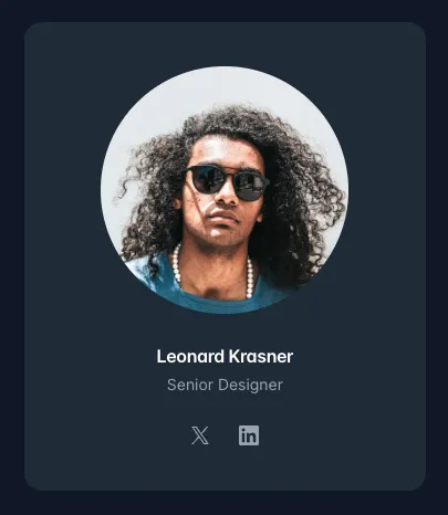
In this challenge, you’ll create a card component for a team member. This card will include:
- A circular image at the top (use placeholders if needed).
- A title and a short description.
- Buttons for their Twitter/X and LinkedIn profiles.
1. Team member card component
Section titled “1. Team member card component”-
First, build out a single ‘card’ in raw HTML/JSX and Tailwind.
Look carefully at how the divs are nested and the classes are applied:
import headshot from "./assets/headshot.webp";import { RiTwitterXFill, RiLinkedinBoxFill } from "react-icons/ri";<div className="rounded-lg bg-slate-800 p-8 w-fit"><imgsrc={headshot}alt="An employee"className="w-64 h-64 rounded-full mx-auto"/><div className="pt-6"><h3 className="text-center font-semi-bold text-white">Leonard Krasner</h3><p className="text-slate-400 text-center pt-1">Senior Designer</p><div className="flex justify-center gap-4 text-slate-400 pt-6"><RiTwitterXFill /><RiLinkedinBoxFill /></div></div></div>
Click to reveal
2. Extract the card into a reusable component
Section titled “2. Extract the card into a reusable component”Next, we need to extract this raw code and wrap it into a resuable component.
2. Use your card component to create the ‘Meet our team’ section below:
Section titled “2. Use your card component to create the ‘Meet our team’ section below:”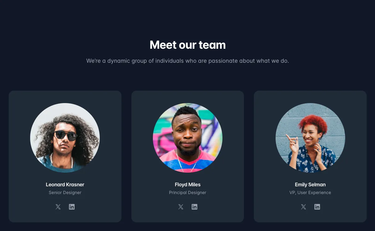
-
Create a new parent div that wraps the entire section, and call your
TeamMemberCardcomponent with different props for each team member:<section><h2 className="text-4xl font-bold text-center">Meet our Team</h2><p className="text-slate-400 text-center py-8">We're a dynamic group of individuals who are passionate about what wedo</p><div className="flex gap-8 justify-center"><TeamMemberCardimgSrc={headshot}name="Leonard Krassler"role="Lead Developer"/><TeamMemberCardimgSrc={headshot2}name="Emily Salmon"role="VP, User Experience"/><TeamMemberCardimgSrc={headshot3}name="Alex Sanders"role="Senior Designer"/></div></section>
Click to reveal