The `useLoaderData` hook
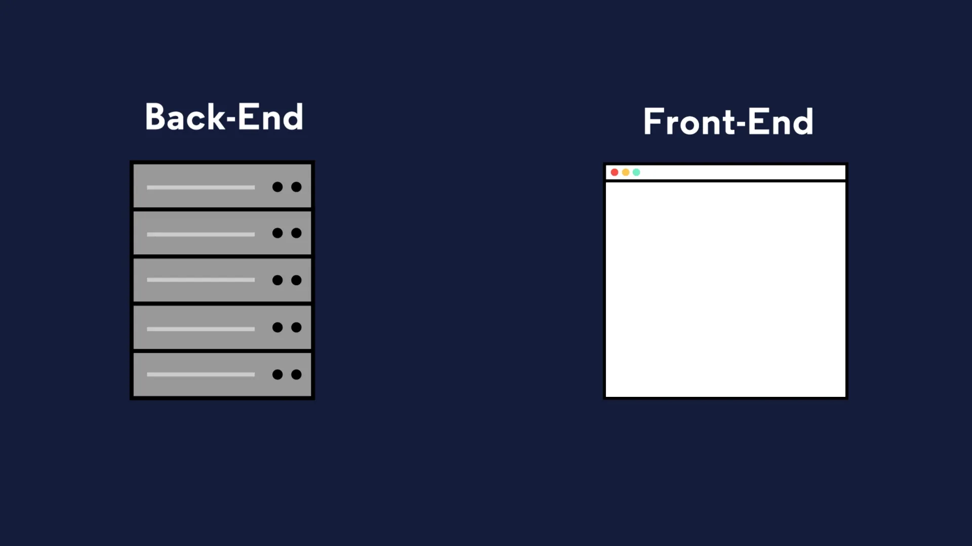
Frontend and backend code
Section titled “Frontend and backend code”In a typical website, code can be split into two main parts:
-
Frontend code
- runs in the user’s browser (the ‘client’)
- written in HTML, CSS and JavaScript
- responsible for
- rendering the website
- handling user interactions
- sending HTTP requests to the server
-
Backend code:
- runs on the server.
- written in JavaScript
- responsible for
- database fetching and updates
- authentication and authorisation
- providing HTTP responses to the client
The loader function
Section titled “The loader function”In Remix, front and backend code is combined into a single file called a route module.
The file we have been working in - root.tsx - is an example of this.
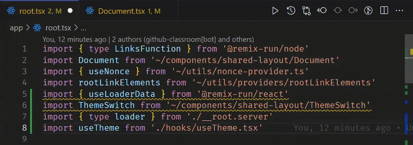
Take another look at the app/root.tsx file:
import { useLoaderData } from 'react-router'import { type Route } from './+types/root.ts'import { type loader } from './__root.server.tsx'import { GeneralErrorBoundary } from './components/error-boundary.tsx'import Document from './components/shared-layout/Document.tsx'import { useNonce } from './utils/nonce-provider.ts'import rootLinkElements from './utils/providers/rootLinkElements.ts'
export const links: Route.LinksFunction = () => { return rootLinkElements}export { meta } from './__root.client.tsx'export { headers, loader } from './__root.server.tsx'
export default function App() { const data = useLoaderData<typeof loader | null>() const nonce = useNonce()
return ( <Document nonce={nonce} honeyProps={data?.honeyProps}> <div className="flex h-screen flex-col justify-between"> <div className="flex-1"> <main className="grid h-full place-items-center"> <h1 className="text-mega">Welcome to Epic News!</h1> </main> </div> </div> </Document> )}
export const ErrorBoundary = GeneralErrorBoundaryYou’ll notice that we are exporting a function from this file called: loader.
export { headers, loader } from './__root.server.tsx'This function is responsible for fetching data from the server and processing it before it is sent to the frontend.
But where is this function defined? The line highlighted above says that the loader function is being exported somehow, but we don’t see them in this file. 🧐
That’s because it is defined in a completely separate file: __root.server.tsx.
If you are interested, open up the __root.server.tsx file and take a look at the loader function. You’ll see that it is responsible for fetching data from the server and sending it to the frontend.
We will be looking more closely at the loader function in a later tutorial.
The useLoaderData hook
Section titled “The useLoaderData hook”useLoaderData is a custom React hook supplied for us by Remix.
Here, it is being used to pass the data from the loader function in __root.server.tsx into the App component running in the browser.
We will look more at this hook later in the module, but for now lets use another hook to get our theme switch working.
Adding the theme switch
Section titled “Adding the theme switch”Making sure you are still inside app/root.tsx, let’s start by updating the import statements at the top of the file.
Add the code highlighted in green to the end of your import statements in app/root.tsx:
import { type LinksFunction } from '@remix-run/node'import Document from '~/components/shared-layout/Document'import { useNonce } from '~/utils/nonce-provider.ts'import rootLinkElements from '~/utils/providers/rootLinkElements'import { ThemeSwitch, useTheme } from './routes/resources+/theme-switch.tsx'Next, carefully add the code highlighted in green below to the App component function itself:
14 collapsed lines
import { useLoaderData } from 'react-router'import { type Route } from './+types/root.ts'import { type loader } from './__root.server.tsx'import { GeneralErrorBoundary } from './components/error-boundary.tsx'import Document from './components/shared-layout/Document.tsx'import { useNonce } from './utils/nonce-provider.ts'import rootLinkElements from './utils/providers/rootLinkElements.ts'import { ThemeSwitch, useTheme } from './routes/resources+/theme-switch.tsx'
export const links: LinksFunction = () => { return rootLinkElements}export { meta } from './__root.client.tsx'export { headers, loader } from './__root.server.tsx'
export default function App() { const data = useLoaderData<typeof loader | null>(); const nonce = useNonce(); const theme = useTheme()
return ( <Document theme={theme} nonce={nonce} honeyProps={data?.honeyProps}> <div className="flex h-screen flex-col justify-between"> <div className="flex-1"> <main className="grid h-full place-items-center"> <h1 className="text-mega">Welcome to Epic News!</h1> </main> </div>
<div className="container flex justify-between pb-5"> <ThemeSwitch userPreference={data?.requestInfo.userPrefs.theme} /> </div> </div> </Document> )}When you are ready, open the explanation below.
1. The useTheme hook
Section titled “1. The useTheme hook”useTheme is a custom React hook (i.e. a function that can only be used inside a React component).
It’s a function that:
- Figures out what theme the user wants (light mode or dark mode)
- Returns that theme as a string (either
'light'or'dark') - Stores the result in the
themevariable
const theme = useTheme()2. How is the theme Variable Used?
Section titled “2. How is the theme Variable Used?”Data Type: The theme variable is a string.
Possible Values:
'light'- Light mode (light background, dark text)'dark'- Dark mode (dark background, light text)
Example:
// If the user prefers dark mode:const theme = useTheme()  // theme = 'dark'
// If the user prefers light mode:const theme = useTheme()  // theme = 'light'
The theme variable is passed to the Document component:
<Document theme={theme} nonce={nonce} honeyProps={data?.honeyProps}> {/* ... rest of the app ... */}</Document>- We’re passing the
themevalue as a prop (property) to theDocumentcomponent - The
Documentcomponent will use this value to apply the correct styling to the entire page
3. The ThemeSwitch Component
Section titled “3. The ThemeSwitch Component”A few lines down, we pass this into the ThemeSwitch component:
<ThemeSwitch userPreference={data?.requestInfo.userPrefs.theme} />The ThemeSwitch component is a button that lets users change the theme of the website.
User Experience:
- User sees an icon (sun, moon, or laptop)
- User clicks the icon
- The theme changes (light → dark → system → light → …)
- The icon updates to show the current mode
The Three Modes:
- Light mode (☀️ sun icon): Everything is light-colored
- Dark mode (🌙 moon icon): Everything is dark-colored
- System mode (💻 laptop icon): Matches your computer/phone’s theme setting
The flow when user clicks
Section titled “The flow when user clicks”1. User clicks the button ↓2. Form submits with nextMode value (e.g., 'dark') ↓3. Request sent to /resources/theme-switch ↓4. Server action runs (saves theme in cookie) ↓5. useOptimisticThemeMode detects the change immediately ↓6. useTheme returns the new theme ↓7. Document component gets new theme ↓8. Page updates with new colors!Compare your notes with the explanation above. Where there are differences, make a note of these.
Testing the light and dark mode toggle button
Section titled “Testing the light and dark mode toggle button”Save your changes, then head back to the browser. You should now be able to toggle the theme between light and dark mode by clicking the button:

🎉 Congratulations! 🎉
Section titled “🎉 Congratulations! 🎉”You now have a working light and dark mode toggle button in your Remix app! 🚀
Automatically organise imports in VS Code
Section titled “Automatically organise imports in VS Code”Finally, lets fix the yellow underlines that might still be showing under your new import statements.
As mentioned earlier, VS Code is warning us that we haven’t used the values, variables and functions that we are importing yet.
Thankfully, VS Code provides us with a keyboard shortcut to automatically organise our imports in the correct order.
- Windows: SHIFT + ALT + O
- Mac: SHIFT + OPTION + O
Press this shortcut now to automatically organise your imports at the top of your file:
Remember to save your file after you have done this, and commit your changes to Git.
Support your explanations with screenshots and code snippets where necessary.
What’s next?
Section titled “What’s next?”In the next step, we will add a navbar and footer to the website to introduce navigation and improve user experience.